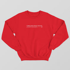

TURBULENCE MUSIC FESTIVAL
CREATIVE BRIEF -------------
Turbulence is an electronic dance music festival hosted at Bruce Campbell's personal home, a decommissioned Boeing 727 aircraft in Portland, Oregon.
After the event, producers Shawn MacArthur & Victor Rundbaken heard about the airplane house through their local news, they saw the potential and wanted to throw a rave there. Using the space as a way to reimagine what Portland, Oregon nightlife could be, they collaborated with the homeowner Bruce Campbell. Together, they were able to create an one-of-a-kind immersive experience by creating imaginative atmospheres and featuring the Northwest premiere electronic dance scene.
CLIENT QUOTE -------------
“The kind of stuff a group of kids might dream up after chugging Slurpees at a sleepover, only with adult budgets and much louder music.”
OBJECTIVES -------------
For the return of Turbulence this upcoming year, the event producers wanted to elevate the event by:
-
Redesign the branding, visual identity system, & promotional items
-
Recreate the one-of-a-kind experience through the redesign
-
Establish branding that will align with Turbulence's identity
-
Increasing the overall attendance & event awareness


POSTER ADVERTISEMENT
CONCEPT -------------
The imagery of the individual ascending above the Earth’s atmosphere encompasses the transcendent experience attendees felt during the previous Turbulence Music Festivals.
Amplified by an uplifting atmosphere, audiences will gain a sense of the immersive and imaginative experience the festival will provide through the poster, which will spark intrigue and further promote the event.
PROCESS -------------


REBRANDING THE STAGES
PURPOSE -------------
To better associate the festival's different areas and music to the brand, the stages were rebranded and renamed.
By dedicated areas for each specific sound and style, the stages were able to create a visual identity that would further complement and explore the depth of their audiovisual experience.
Organizing the festival also improves the ability of the attendees to discover and find more at the event.
COMPARISON -------------
PREVIOUS STAGE NAME:
AIRPLANE
TREEHOUSE
ALIEN PLANET
MYSTIC WOODS
RENAMED STAGES:
MAIN TERMINAL
BALLISTIC THUNDER
SONIC SKIES
COSMIC STORM
NEW THEMES -------------
MAIN TERMINAL: The Turbulence Music Festival’s main stage.
BALLISTIC THUNDER: The epicenter for explosive hard bass energy.
SONIC SKIES: Immersive audiovisuals for the sensation of sound.
COSMIC STORM: A psychedelic trip across the infinite cosmos.


REDESIGNING THE LOGO
COMPARISON -------------

PREVIOUS

REDESIGNED
INSPIRATION -------------
Aviation lapel pins, wind turbines, & the letter t inspired the redesign logo form.
Geometric angular forms and fantasy design elements are added to represent Turbulence Music Festival's imaginative cutting edge qualities.
Overall, the mark references aviation lapel pins for pilots, symbolizing the event producer's mission to be pioneers, elevating Portland's nightlife scene by creating adventurously unique events and enhanced experiences.
SKETCHES -------------
RESPONSIVE LOGO-------------
Turbulence’s logo was also adapted into different variations to ensure the mark can become a scalable system used in many multiple applications & sizes.


THE MERCHANDISE
PURPOSE -------------
As the music industry evolved, event and concert merchandise has become an essential part of creating a multimedia experience. The event t-shirts have become tokens of memorabilia.
It has become an extension of their brands. By selling merchandise, Turbulence Music Festival fans can express their love for the brand and engage with a new potential audience.
DESIGN -------------
For the 2021 collection, the merchandise line prominently features the redesigned logo to connect the new mark to the festival’s rebrand.
Additional elements inspired by aviation, streetwear, and the music culture are added to the design to establish the Turbulence Music Festival’s visual identity system and appeal to their 21–35 age target demographic.

THE TAKEAWAYS
IMPACT -------------
The rebrand elevated Turbulence Music Festival by establishing a strong visual identity reflective of the brand’s mission. This new identity helped promotions by communicating the imaginative multi-experience the event planner intends to produce for the festival.
The stages rebrand add to the immersive experience and develop Turbulence Music Festival’s audiovisual world.
Creating a more versatile logo allowed the mark to become transferable across different types of media and applications.
The new logo is applied to the merchandise line to create tangible ways for Turbulence Music Festival to engage and connect their audience to the rebrand.
DELIVERABLES-------------
-
Baseball Jersey
-
Beanies
-
Bomber Jacket
-
Brand Strategy
-
Business Cards
-
Color System
-
Crewneck Sweater
-
Guitar Pick
-
Handheld Fans
-
Headliner Poster
-
Logo Redesign
-
Long Sleeve
-
Main Poster
-
Pullover Hoodie
-
Schedule Poster
-
Stage Passes
-
Stage Rebrand
-
T-Shirt
-
Visual Identity System
-
Water Bottles
-
Wristband Tickets


